
Components
upSWOT Customization parameters
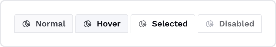
Accordion
Accordion is a collapsible content container that allows users to reveal or hide additional information by clicking on its headers. It is helpful for organizing and presenting content compactly, providing a structured layout for a better user experience.

Base
Property | Variable | Description |
|---|---|---|
| Font | - -us-accordion-base-font | Changes the font style of the Accordion title. |
| Font color | - -us-accordion-base-color | |
| Icon color | - -us-accordion-base-icon-color | |
| Vertical paddings | - -us-accordion-base-v-padding | |
| Horizontal paddings | - -us-accordion-base-h-padding | |
| Border | - -us-accordion-base-border | This variable includes both color and style. |
| Border width | - -us-accordion-base-border-width | |
| Border radius | - -us-accordion-base-border-radius |
Normal
Property | Variable | Description |
|---|---|---|
| Background | - -us-accordion-normal-bg-color |
Hover
Property | Variable |
|---|---|
| Icon color | - -us-accordion-hover-icon-color |
| Background | - -us-accordion-hover-bg-color |
Pressed
Property | Variable |
|---|---|
| Background | - -us-accordion-pressed-bg-color |
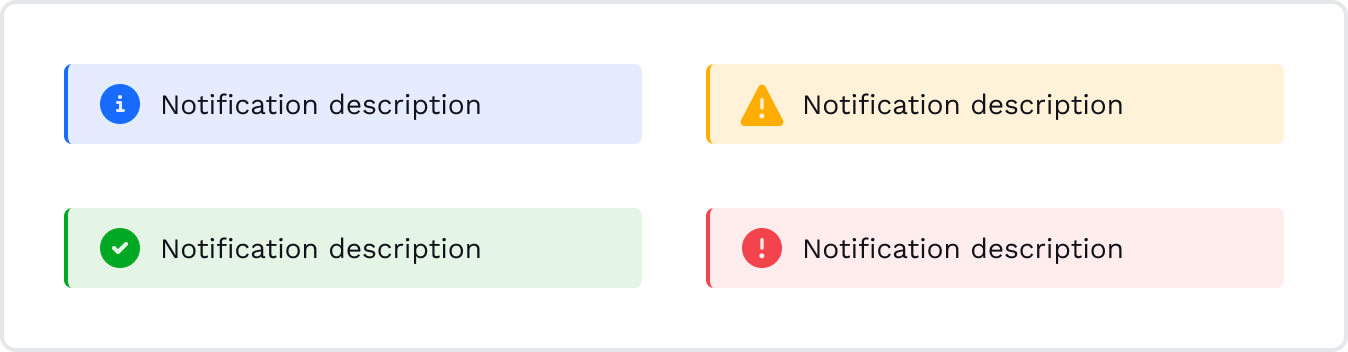
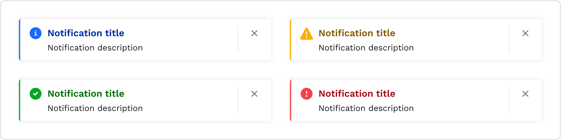
Alert
The Alert component displays contextual messages to users, conveying important information or feedback. Each Alert variant may include an optional link after the text inside the Alert. This link can lead to related content or further actions to assist users in resolving the situation or taking appropriate steps.
Alerts are typically displayed at the top or bottom of a page or within specific sections, ensuring their visibility and impact on user interactions.
Base
These are base variables for all Badge types that are mentioned below.
Property | Variable |
|---|---|
| Vertical padding | - -us-alert-base-v-padding |
| Horizontal padding | - -us-alert-base-h-padding |
| Border radius | - -us-alert-base-border-radius |
| Border width | - -alert-base-border-width |
Info
It provides informational messages to users, offering additional context or guidance without indicating any critical action.
Property | Variable |
|---|---|
| Background color | - -us-alert-info-bg-color |
| Left border | - -us-alert-info-border-left |
| Icon color | - -us-alert-info-icon-color |
Success
It indicates a successful completion or confirmation of an action, providing positive feedback to users.
Property | Variable |
|---|---|
| Background color | - -us-alert-success-bg-color |
| Left border | - -us-alert-success-border-left |
| Icon color | - -us-alert-success-icon-color |
Warning
It indicates potential issues or warnings that users should be aware of and helps draw attention to situations that require caution.
Property | Variable |
|---|---|
| Background color | - -us-alert-warning-bg-color |
| Left border | - -us-alert-warning-border-left |
| Icon color | - -us-alert-warning-icon-color |
Danger
This variable indicates critical information about situations that may require additional attention or appropriate measures needed.
Property | Variable |
|---|---|
| Background color | - -us-alert-danger-bg-color |
| Left border | - -us-alert-danger-border-left |
| Icon color | - -us-alert-danger-icon-color |
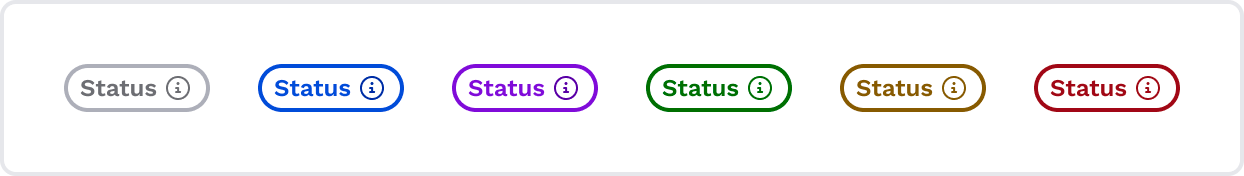
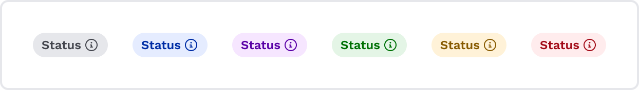
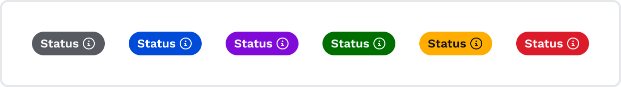
Badge and Trend
The Badge component is used to visually represent specific statuses, attributes, or dynamic information in a concise and eye-catching manner. Additionally, a Badge may include an optional icon that triggers a tooltip to provide supplementary explanations or further details about the dynamic data represented by the Badge.
General
These are base variables for all Badge types that are mentioned below.
Property | Variable name |
|---|---|
| Vertical padding | - -us-badge-general-v-padding |
| Horizontal padding | - -us-badge-general-h-padding |
| Border radius | - -us-badge-general-border-radius |
Low Contrast
Low Contrast Badges suitable for amounts and gaps.
Neutral Status
It is a versatile option used to represent neutral states, providing subtle information without indicating any particular status (e.g. 0% gap).
Property | Variable name |
|---|---|
| Font color | - -us-badge-low-contrast-neutral-text-color |
| Background | - -us-badge-low-contrast-neutral-background-color |
| Border color | - -us-badge-low-contrast-neutral-border-color |
Primary Status
It is used to emphasize important or primary attributes, actions, or states. It plays the role of an info badge.
Property | Variable name |
|---|---|
| Font color | - -us-badge-low-contrast-primary-text-color |
| Background | - -us-badge-low-contrast-primary-background-color |
| Border color | - -us-badge-low-contrast-primary-border-color |
Secondary Status
It complements the Primary Badge, providing secondary information in the user interface.
Property | Variable name |
|---|---|
| Font color | - -us-badge-low-contrast-secondary-text-color |
| Background | - -us-badge-low-contrast-secondary-background-color |
| Border color | - -us-badge-low-contrast-secondary-border-color |
Success Status
It indicates positive gaps or progress status.
Property | Variable name |
|---|---|
| Font color | - -us-badge-low-contrast-success-text-color |
| Background | - -us-badge-low-contrast-success-background-color |
| Border color | - -us-badge-low-contrast-success-border-color |
Warning Status
It is used to indicate potential issues or warnings that require user attention.
Property | Variable name |
|---|---|
| Font color | - -us-badge-low-contrast-warning-text-color |
| Background | - -us-badge-low-contrast-warning-background-color |
| Border color | - -us-badge-low-contrast-warning-border-color |
Error Status
It is used to highlight high-priority messages about negative gaps or amounts.
Property | Variable name |
|---|---|
| Font color | - -us-badge-low-contrast-error-text-color |
| Background | - -us-badge-low-contrast-error-background-color |
| Border color | - -us-badge-low-contrast-error-border-color |
Moderate Contrast
Moderate Contrast Badges offer a balanced appearance for most regular usage scenarios. Always used as transaction tags.
Neutral Status
It is a versatile option used to represent neutral states, providing subtle information without indicating any particular status (e.g. Ignore payment).
Property | Variable name |
|---|---|
| Font color | - -us-badge-moderate-contrast-neutral-text-color |
| Background | - -us-badge-moderate-contrast-neutral-background-color |
| Border color | - -us-badge-moderate-contrast-neutral-border-color |
Primary Status
It is always used to show a transaction frequency (e.g. Monthly, Weekly, Yearly).
Property | Variable name |
|---|---|
| Font color | - -us-badge-moderate-contrast-primary-text-color |
| Background | - -us-badge-moderate-contrast-primary-background-color |
| Border color | - -us-badge-moderate-contrast-primary-border-color |
Secondary Status
It provides secondary information in the user interface (e.g. Boost score).
Property | Variable name |
|---|---|
| Font color | - -us-badge-moderate-contrast-secondary-text-color |
| Background | - -us-badge-moderate-contrast-secondary-background-color |
| Border color | - -us-badge-moderate-contrast-secondary-border-color |
Success Status
It indicates successful completion, confirmation, or positive status and is used to provide positive feedback to the users.
Property | Variable name |
|---|---|
| Font color | - -us-badge-moderate-contrast-success-text-color |
| Background | - -us-badge-moderate-contrast-success-background-color |
| Border color | - -us-badge-moderate-contrast-success-border-color |
Warning Status
It is used to indicate potential issues or warnings that require user attention. It helps draw attention to important notifications or actions.
Property | Variable name |
|---|---|
| Font color | - -us-badge-moderate-contrast-warning-text-color |
| Background | - -us-badge-moderate-contrast-warning-background-color |
| Border color | - -us-badge-moderate-contrast-warning-border-color |
Error Status
It is used to highlight high-priority messages (e.g. Overdue payment).
Property | Variable name |
|---|---|
| Font color | - -us-badge-moderate-contrast-error-text-color |
| Background | - -us-badge-moderate-contrast-error-background-color |
| Border color | - -us-badge-moderate-contrast-error-border-color |
High Contrast
High Contrast Badges provide a bold and prominent appearance, ideal for emphasizing critical information or strong visual impact. Usually displays important statuses (e.g. ‘Important’, ‘Attention’).
Neutral Status
It is a versatile option used to represent neutral states, providing subtle information without indicating any particular status.
Property | Variable name |
|---|---|
| Font color | - -us-badge-high-contrast-neutral-text-color |
| Background | - -us-badge-high-contrast-neutral-background-color |
| Border color | - -us-badge-high-contrast-neutral-border-color |
Primary Status
It is always used to show the Info status of actionable insights.
Property | Variable name |
|---|---|
| Font color | - -us-badge-high-contrast-primary-text-color |
| Background | - -us-badge-high-contrast-primary-background-color |
| Border color | - -us-badge-high-contrast-primary-border-color |
Secondary Status
Property | Variable name |
|---|---|
| Font color | - -us-badge-high-contrast-secondary-text-color |
| Background | - -us-badge-high-contrast-secondary-background-color |
| Border color | - -us-badge-high-contrast-secondary-border-color |
Success Status
It is always used to show the Good status of actionable insights.
Property | Variable name |
|---|---|
| Font color | - -us-badge-high-contrast-success-text-color |
| Background | - -us-badge-high-contrast-success-background-color |
| Border color | - -us-badge-high-contrast-success-border-color |
Warning Status
It is always used to show the Attention status of actionable insights.
Property | Variable name |
|---|---|
| Font color | - -us-badge-high-contrast-warning-text-color |
| Background | - -us-badge-high-contrast-warning-background-color |
| Border color | - -us-badge-high-contrast-warning-border-color |
Error Status
It is always used to show the Important status of actionable insights.
Property | Variable name |
|---|---|
| Font color | - -us-badge-high-contrast-error-text-color |
| Background | - -us-badge-high-contrast-error-background-color |
| Border color | - -us-badge-high-contrast-error-border-color |
Trend
The Trend component is used to visually represent directional changes or trends in data, showing either positive or negative values.
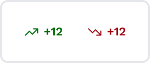
There are two main variations of the Trend element.
Trend up
It is represented by an arrow pointing upwards and indicates a positive value or an increasing trend in data. It signifies growth, improvement, or positive progress.
Property | Variable name |
|---|---|
| Font color | - -us-trend-up-text-color |
Trend down
It is represented by an arrow pointing downwards and indicates a negative value or a decreasing trend in data. It signifies decline, reduction, or negative changes.
Property | Variable name |
|---|---|
| Font color | - -us-trend-down-text-color |
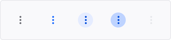
Button and Icon-button
The Button component is a crucial interactive element used for initiating actions or operations within the user interface.
General
Property | Variable name | Description |
|---|---|---|
| Border radius | - -us-button-general-border-radius | This variable is for all variants except "Icon-secondary". |
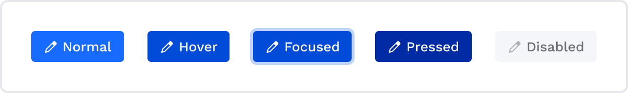
Primary
The Primary Button is the main call-to-action element, intended to draw users' attention to important or primary actions. It has a distinctive appearance that stands out from other interface elements.
Property | Variable name | Description |
|---|---|---|
| Font | --us-button-primary-font | This variable is for all variants except "Icon-secondary". |
| Font color | --us-button-primary-text-color | |
| Vertical padding | --us-button-primary-v-padding | Same for all Primary button states. |
| Horizontal padding | --us-button-primary-h-padding | Same for all Primary button states. |
| Border radius | --us-button-primary-border-radius | Same for all Primary button states. |
| Background | --us-button-primary-background | |
| Icon color | --us-button-primary-icon-color | |
| Border width | --us-button-primary-border-width | |
| Border color | --us-button-primary-border-color |
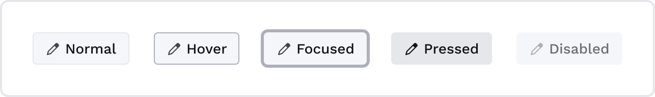
Hover
Property | Variable name |
|---|---|
| Font color | - -us-button-primary-text-hover-color |
| Background | - -us-button-primary-background-hover |
| Icon color | - -us-button-primary-icon-hover-color |
| Border width | - -us-button-primary-border-hover-width |
| Border color | - -us-button-primary-border-hover-color |
Focused
Property | Variable name |
|---|---|
| Font color | - -us-button-primary-text-focused-color |
| Background | - -us-button-primary-background-focused |
| Icon color | - -us-button-primary-icon-focused-color |
| Border width | - -us-button-primary-border-focused-width |
| Border color | - -us-button-primary-border-focused-color |
Pressed
Property | Variable name |
|---|---|
| Font color | - -us-button-primary-text-pressed-color |
| Background | - -us-button-primary-background-pressed |
| Icon color | - -us-button-primary-icon-pressed-color |
| Border width | - -us-button-primary-border-pressed-width |
| Border color | - -us-button-primary-border-pressed-color |
Disabled
Property | Variable name |
|---|---|
| Font color | - -us-button-primary-text-disabled-color |
| Background | - -us-button-primary-background-disabled |
| Icon color | - -us-button-primary-icon-disabled-color |
| Border width | - -us-button-primary-border-disabled-width |
| Border color | - -us-button-primary-border-disabled-color |
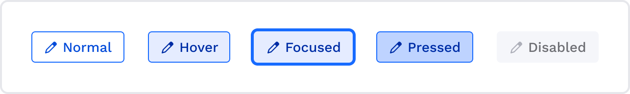
Secondary
The Secondary Button is used for secondary actions or alternatives to the primary action. It has a visually subdued appearance, often presented alongside the primary button.
Property | Variable name | Description |
|---|---|---|
| Font | --us-button-secondary-font | Font property includes both font weight and font size. This variable is the same for all Secondary button states. |
| Font color | --us-button-secondary-text-color | |
| Vertical padding | --us-button-secondary-v-padding | Same for all Secondary button states. |
| Horizontal padding | --us-button-secondary-h-padding | Same for all Secondary button states. |
| Border radius | --us-button-secondary-border-radius | Same for all Secondary button states. |
| Background | --us-button-secondary-background | |
| Icon color | --us-button-secondary-icon-color | |
| Border width | --us-button-secondary-border-width | |
| Border color | --us-button-secondary-border-color |
Hover
Property | Variable name |
|---|---|
| Font color | - -us-button-secondary-text-hover-color |
| Background | - -us-button-secondary-background-hover |
| Icon color | - -us-button-secondary-icon-hover-color |
| Border width | - -us-button-secondary-border-hover-width |
| Border color | - -us-button-secondary-border-hover-color |
Focused
Property | Variable name |
|---|---|
| Font color | - -us-button-secondary-text-focused-color |
| Background | - -us-button-secondary-background-focused |
| Icon color | - -us-button-secondary-icon-focused-color |
| Border width | - -us-button-secondary-border-focused-width |
| Border color | - -us-button-secondary-border-focused-color |
Pressed
Property | Variable name |
|---|---|
| Font color | - -us-button-secondary-text-pressed-color |
| Background | - -us-button-secondary-background-pressed |
| Icon color | - -us-button-secondary-icon-pressed-color |
| Border width | - -us-button-secondary-border-pressed-width |
| Border color | - -us-button-secondary-border-pressed-color |
Disabled
Property | Variable name |
|---|---|
| Font color | - -us-button-secondary-text-disabled-color |
| Background | - -us-button-secondary-background-disabled |
| Icon color | - -us-button-secondary-icon-disabled-color |
| Border width | - -us-button-secondary-border-disabled-width |
| Border color | - -us-button-secondary-border-disabled-color |
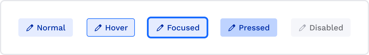
Tertiary-action
The Tertiary Action Button is used to represent actions that are less frequently used or service actions (like edit). It complements the primary and secondary buttons and is typically used for less critical actions.
Property | Variable name | Description |
|---|---|---|
| Font | --us-button-tertiary-action-font | Font property includes both font weight and font size. This variable is the same for all Tertiary-action button states. |
| Font color | --us-button-tertiary-action-text-color | |
| Vertical padding | --us-button-tertiary-action-v-padding | Same for all Tertiary-action button states. |
| Horizontal padding | --us-button-tertiary-action-h-padding | Same for all Tertiary-action button states. |
| Border radius | --us-button-tertiary-action-border-radius | Same for all Tertiary-action button states. |
| Background | --us-button-tertiary-action-background | |
| Icon color | --us-button-tertiary-action-icon-color | |
| Border width | --us-button-tertiary-action-border-width | |
| Border color | --us-button-tertiary-action-border-color |
Hover
Property | Variable name |
|---|---|
| Font color | - -us-button-tertiary-action-text-hover-color |
| Background | - -us-button-tertiary-action-background-hover |
| Icon color | - -us-button-tertiary-action-icon-hover-color |
| Border width | - -us-button-tertiary-action-border-hover-width |
| Border color | - -us-button-tertiary-action-border-hover-color |
Focused
Property | Variable name |
|---|---|
| Font color | - -us-button-tertiary-action-text-focused-color |
| Background | - -us-button-tertiary-action-background-focused |
| Icon color | - -us-button-tertiary-action-icon-focused-color |
| Border width | - -us-button-tertiary-action-border-focused-width |
| Border color | - -us-button-tertiary-action-border-focused-color |
Pressed
Property | Variable name |
|---|---|
| Font color | - -us-button-tertiary-action-text-pressed-color |
| Background | - -us-button-tertiary-action-background-pressed |
| Icon color | - -us-button-tertiary-action-icon-pressed-color |
| Border width | - -us-button-tertiary-action-border-pressed-width |
| Border color | - -us-button-tertiary-action-border-pressed-color |
Disabled
Property | Variable name |
|---|---|
| Font color | - -us-button-tertiary-action-text-disabled-color |
| Background | - -us-button-tertiary-action-background-disabled |
| Icon color | - -us-button-tertiary-action-icon-disabled-color |
| Border width | - -us-button-tertiary-action-border-disabled-width |
| Border color | - -us-button-tertiary-action-border-disabled-color |
Tertiary-neutral
The Tertiary Neutral Button is used to represent actions that are less frequently used or service actions (like details).
Property | Variable name | Description |
|---|---|---|
| Font | --us-button-tertiary-neutral-font | Font property includes both font weight and font size. This variable is the same for all Tertiary-neutral button states. |
| Font color | --us-button-tertiary-neutral-text-color | |
| Vertical padding | --us-button-tertiary-neutral-v-padding | Same for all Tertiary-neutral button states. |
| Horizontal padding | --us-button-tertiary-neutral-h-padding | Same for all Tertiary-neutral button states. |
| Border radius | --us-button-tertiary-neutral-border-radius | Same for all Tertiary-neutral button states. |
| Background | --us-button-tertiary-neutral-background | |
| Icon color | --us-button-tertiary-neutral-icon-color | |
| Border width | --us-button-tertiary-neutral-border-width | |
| Border color | --us-button-tertiary-neutral-border-color |
Hover
Property | Variable name |
|---|---|
| Font color | - -us-button-tertiary-neutral-text-hover-color |
| Background | - -us-button-tertiary-neutral-background-hover |
| Icon color | - -us-button-tertiary-neutral-icon-hover-color |
| Border width | - -us-button-tertiary-neutral-border-hover-width |
| Border color | - -us-button-tertiary-neutral-border-hover-color |
Focused
Property | Variable name |
|---|---|
| Font color | - -us-button-tertiary-neutral-text-focused-color |
| Background | - -us-button-tertiary-neutral-background-focused |
| Icon color | - -us-button-tertiary-neutral-icon-focused-color |
| Border width | - -us-button-tertiary-neutral-border-focused-width |
| Border color | - -us-button-tertiary-neutral-border-focused-color |
Pressed
Property | Variable name |
|---|---|
| Font color | - -us-button-tertiary-neutral-text-pressed-color |
| Background | - -us-button-tertiary-neutral-background-pressed |
| Icon color | - -us-button-tertiary-neutral-icon-pressed-color |
| Border width | - -us-button-tertiary-neutral-border-pressed-width |
| Border color | - -us-button-tertiary-neutral-border-pressed-color |
Disabled
Property | Variable name |
|---|---|
| Font color | - -us-button-tertiary-neutral-text-disabled-color |
| Background | - -us-button-tertiary-neutral-background-disabled |
| Icon color | - -us-button-tertiary-neutral-icon-disabled-color |
| Border width | - -us-button-tertiary-neutral-border-disabled-width |
| Border color | - -us-button-tertiary-neutral-border-disabled-color |
Like variant (tertiary-neutral differences)
The Like button fully inherits the properties of the tertiary neutral button, except for the pressed state.
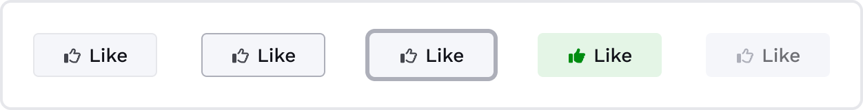
Pressed
Property | Variable name |
|---|---|
| Background | - -us-button-like-background-pressed |
| Font color | - -us-button-like-text-pressed-color |
| Icon color | - -us-button-like-icon-pressed-color |
Dislike variant (tertiary-neutral differences)
The Dislike button fully inherits the properties of the tertiary neutral button, except for the pressed state.
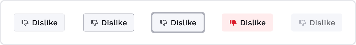
Pressed
Property | Variable name |
|---|---|
| Background | - -us-button-dislike-background-pressed |
| Font color | - -us-button-dislike-text-pressed-color |
| Icon color | - -us-button-dislike-icon-pressed-color |
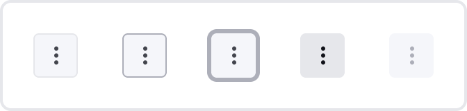
Primary Icon-button
The Primary Icon-button is similar to the Tertiary Neutral Button but contains only an icon, providing a simple, visually distinct representation of a specific action.
Property | Variable name |
|---|---|
| Border radius | - -us-button-icon-primary-border-radius |
| Border width | - -us-button-icon-primary-border-width |
| Border color | - -us-button-icon-primary-border-color |
| Background | - -us-button-icon-primary-background |
| Icon color | - -us-button-icon-primary-icon-color |
| Box shadow | - -us-button-icon-primary-icon-boxshadow |
| Vertical padding | - -us-button-icon-primary-v-padding |
| Horizontal padding | - -us-button-icon-primary-h-padding |
Hover
Property | Variable name |
|---|---|
| Border width | - -us-button-icon-primary-border-hover-width |
| Border color | - -us-button-icon-primary-border-hover-color |
| Background | - -us-button-icon-primary-background-hover |
| Icon Color | - -us-button-icon-primary-icon-hover-color |
| Box shadow | - -us-button-icon-primary-icon-boxshadow-hover |
Focused
Property | Variable name |
|---|---|
| Border width | - -us-button-icon-primary-border-focused-width |
| Border color | - -us-button-icon-primary-border-focused-color |
| Background | - -us-button-icon-primary-background-focused |
| Icon Color | - -us-button-icon-primary-icon-focused-color |
Pressed
Property | Variable name |
|---|---|
| Border width | - -us-button-icon-primary-border-pressed-width |
| Border color | - -us-button-icon-primary-border-pressed-color |
| Background | - -us-button-icon-primary-background-pressed |
| Icon Color | - -us-button-icon-primary-icon-pressed-color |
Disabled
Property | Variable name |
|---|---|
| Border width | - -us-button-icon-primary-border-disabled-width |
| Border color | - -us-button-icon-primary-border-disabled-color |
| Background | - -us-button-icon-primary-background-disabled |
| Icon Color | - -us-button-icon-primary-icon-disabled-color |
Icon-secondary (light variant)
A light variant of the Secondary Icon-button is used for a light background (e.g., table header, chips). It is available in Medium and Small sizes.
Property | Variable name |
|---|---|
| Background | - -us-button-icon-secondary-light-background |
| Icon color | - -us-button-icon-secondary-light-hover-color |
| Box Shadow | - -us-button-icon-secondary-light-boxshadow |
Hover
Property | Variable name |
|---|---|
| Background | - -us-button-icon-secondary-light-hover-background |
| Icon Color | - -us-button-icon-secondary-light-hover-color |
| Box shadow | - -us-button-icon-secondary-light-boxshadow-hover |
Focused
Property | Variable name |
|---|---|
| Background | - -us-button-icon-secondary-light-focused-background |
| Icon color | - -us-button-icon-secondary-light-focused-color |
Pressed
Property | Variable name |
|---|---|
| Background | - -us-button-icon-secondary-light-pressed-background |
| Icon color | - -us-button-icon-secondary-light-pressed-color |
| Box Shadow | - -us-button-icon-secondary-light-boxshadow-pressed |
Disabled
Property | Variable name |
|---|---|
| Background | - -us-button-icon-secondary-light-disabled-background |
| Icon color | - -us-button-icon-secondary-light-disabled-color |
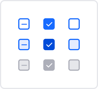
Checkbox
The Checkbox component is an input element that enables users to select one or more options from a set of choices. It is typically presented as a small box that users can check or uncheck. The Checkbox allows users to toggle between two states: checked and unchecked.
Base
Property | Variable name | Description |
|---|---|---|
| Width | --us-checkbox-base-width | |
| Height | --us-checkbox-base-height | |
| Border width | --us-checkbox-border-width | |
| Border radius | --us-checkbox-border-radius | |
| Border color | --us-checkbox-border-color | |
| Border color | --us-checkbox-inactive-border-color | This variable changes the border-color in the inactive Checkbox component. |
Unselected
Property | Variable name | Description |
|---|---|---|
| Background | --us-checkbox-unselected-active-bg-color | This variable is used to change the background color in the default unselected Checkbox component while it is active. |
| Background | --us-checkbox-unselected-active-hover-bg-color | This variable changes the background color in the hover unselected Checkbox component while it is active. |
| Background | --us-checkbox-unselected-inactive-bg-color | This variable is used to change the background color in the unselected Checkbox component while it is inactive. |
Selected
Property | Variable name | Description |
|---|---|---|
| Background | --us-checkbox-selected-active-bg-color | This variable changes the background color in the default selected Checkbox component while it is active. |
| Background | --us-checkbox-selected-active-hover-bg-color | This variable is used to change the background color in the hover-selected Checkbox component while it is active. |
| Background | --us-checkbox-selected-inactive-bg-color | This variable is used to change the background color in the selected Checkbox component while it is inactive. |
Intermediate
Property | Variable name | Description |
|---|---|---|
| Background | --us-checkbox-intermediate-active-bg-color | This variable changes the background color in the default intermediate Checkbox component while it is active. |
| Background | --us-checkbox-intermediate-active-hover-bg-color | This variable is used to change the background color in the hover intermediate Checkbox component while it is active. |
| Background | --us-checkbox-intermediate-inactive-bg-color | This variable is used to change the background color in the intermediate Checkbox component while it is inactive. |
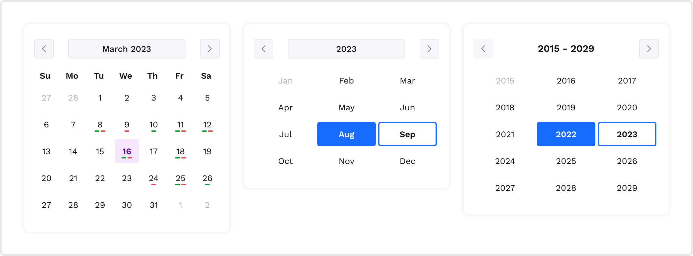
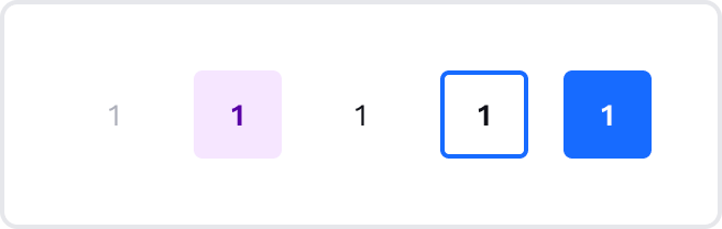
Date Picker
Date picker is an element used to select dates or date ranges from a calendar view. It provides users with an interactive and intuitive way to choose specific dates, making it ideal for date-based data input.
Shadow
Property | Variable name |
|---|---|
| Shadow | - -us-date-picker-shadow |
Date
Property | Variable name |
|---|---|
| Width | - -us-date-picker-date-width |
| Size | - -us-date-picker-date-height |
| Border radius | - -us-date-picker-date-border-radius |
Events
Events are used in the Payment calendar component to show cash-in (positive) and cash-out (negative) transactions.
Property | Variable name |
|---|---|
| Width | - -us-date-picker-event-width |
| Size | - -us-date-picker-event-height |
| Border radius | - -us-date-picker-event-border-radius |
Footer
The Footer component is positioned at the bottom of the web component interface, providing users with additional information and navigation options. It can contain 1 or 2 buttons, copyright details, contact information, links to privacy policies, terms of service, and a checkbox.
Note:The only top border is available to be changed in the Footer component.
Property | Variable name |
|---|---|
| Background | - -us-footer-bg-color |
| Vertical paddings | - -us-footer-v-padding |
| Horizontal paddings | - -us-footer-h-padding |
| Border width | - -us-footer-border-top-width |
| Border color | - -us-footer-border-top-color |
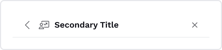
Header
The Header component is a critical section located at the top of the web component interface. It provides users with essential navigation and is divided into two main variations: Primary Header and Secondary Header.
Primary
The Primary Header serves as the primary navigation section. It is the main header for web components. It can include insights and more info icons.
Property | Variable name | Description |
|---|---|---|
| Font | --us-header-primary-title-font-style | This variable changes the font style of the Primary Header component title. |
| Font color | --us-header-primary-text-color | |
| Icon color | --us-header-primary-icon-color | |
| Background | --us-header-primary-bg-color | |
| Height | --us-header-primary-min-height | This variable changes the minimal height of the Primary Header component. |
| Vertical padding | --us-header-primary-v-padding | |
| Horizontal padding | --us-header-primary-h-padding | |
| Border color | --us-header-primary-border-bottom-color | This variable changes the bottom border color. |
| Border width | --us-header-primary-border-bottom-width | This variable changes the bottom border width. |
| Border style | --us-header-primary-border-bottom-style | This variable changes the bottom border style. |
Notifications
Property | Variable name |
|---|---|
| Background | - -us-notification-bg-color |
| Font color | - -us-notification-text-color |
Secondary
The Secondary Header is for pages in web components. It can include the main icon, chevron-left, and close icon.
Property | Variable name | Description |
|---|---|---|
| Font | --us-header-secondary-title-font-style | This variable changes the font style of the Secondary Header component title. |
| Font color | --us-header-secondary-text-color | |
| Icon color | --us-header-secondary-icon-color | |
| Background | --us-header-secondary-bg-color | |
| Height | --us-header-secondary-min-height | This variable changes the minimal height of the Secondary Header component. |
| Vertical padding | --us-header-secondary-v-padding | |
| Horizontal padding | --us-header-secondary-h-padding | |
| Border color | --us-header-secondary-border-bottom-color | This variable changes the bottom border color. |
| Border width | --us-header-secondary-border-bottom-width | This variable changes the bottom border width. |
| Border style | --us-header-secondary-border-bottom-style | This variable changes the bottom border style. |
Input
The Input component is a fundamental user interface element for data entry and user interactions. It allows users to input text, numbers, or other data into a form or field within the interface.
The Input element presents a text box where users can type, edit, or delete text. It supports various input types, including single-line inputs for short text or numbers and multi-line inputs for longer text or user comments.
Design considerations for the Input element include proper labels, placeholder text, and error messaging to guide users effectively. Providing clear visual cues such as focus states and input validation helps users understand how to interact with the Input and ensures a seamless data entry experience.
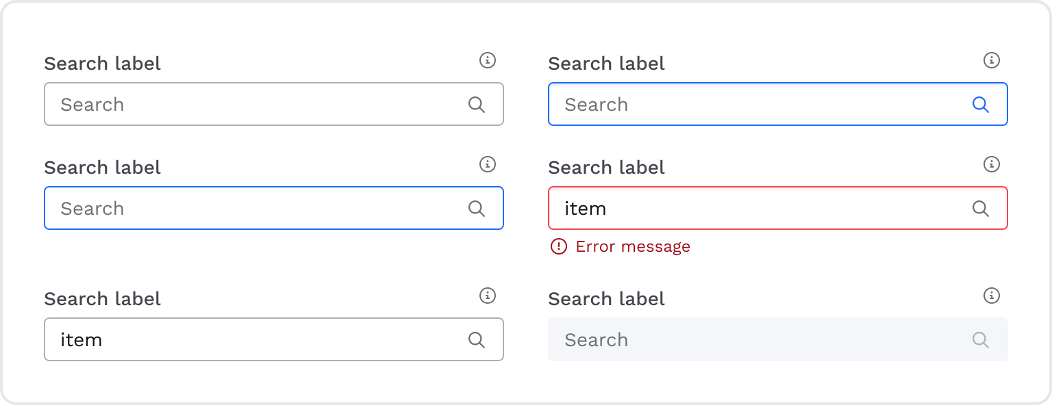
Default
Property | Variable name | Description |
|---|---|---|
| Placeholder color | --us-input-placeholder-color | This variable is used to change the font and icon colors of the input in the unfilled state. |
| Label color | --us-input-label-color | |
| Background | --us-input-bg-color | |
| Vertical padding | --us-input-v-padding | |
| Horizontal padding | --us-input-h-padding | |
| Margins | --us-input-margins | It is the distance between the label and input, input and error message. |
| Border radius | --us-input-border-radius | |
| Border color | --us-input-border-color | |
| Border width | --us-input-border-width | |
| Font color | --us-input-font-color | This variable is used to change the font color of the input in the filled (or normal) state. |
| Icon color | --us-input-icon-color | This variable is used to change the icon color of the input in the filled (or normal) state. |
Hover
Property | Variable name |
|---|---|
| Border color | - -us-input-hover-border-color |
| Font color | - -us-input-hover-font-color |
| Label color | - -us-input-hover-label-color |
| Background | - -us-input-hover-bg-color |
Focused
Property | Variable name | Description |
|---|---|---|
| Border color | --us-input-focus-border-color | |
| Font color | --us-input-focus-font-color | |
| Label color | --us-input-focus-label-color | |
| Background | --us-input-focus-bg-color | |
| Icon color | --us-input-focus-icon-color | |
| Shadow | --us-input-focus-inner-shadow | It is the inner shadow (Input-focus) that is used only for a focused state. |
Error
Property | Variable name | Description |
|---|---|---|
| Border color | --us-input-error-border-color | |
| Font color | --us-input-error-font-color | |
| Label color | --us-input-error-label-color | |
| Background | --us-input-error-bg-color | |
| Shadow | --us-input-error-inner-shadow | It is the inner shadow (Input-focus) that is used only for a focused state. |
| Font color | --us-input-error-message-font-color | This variable is used to change the font color of the error message below the input. |
| Icon color | --us-input-error-message-icon-color | This variable is used to change the icon color of the error message below the input. |
Disabled
Property | Variable name |
|---|---|
| Border color | - -us-input-disabled-border-color |
| Font color | - -us-input-disabled-font-color |
| Label color | - -us-input-disabled-label-color |
| Background | - -us-input-disabled-bg-color |
| Icon color | - -us-input-disabled-icon-color |
button
The Insight Button is a specialized user interface element that provides valuable insights or information derived from specific parameters or data. It serves as a visual indicator to showcase the basis for the insight. The Insight Button enhances the user experience by providing valuable data-driven insights and facilitating informed decision-making.
Property | Variable name | Description |
|---|---|---|
| Paddings | --us-insight-button-padding | This variable is used to change both vertical and horizontal paddings. It is the same for all states of the Insight button component. |
| Border radius | --us-insight-button-border-radius | |
| Background | --us-insight-button-background | |
| Icon color | --us-insight-button-color | |
| Border | --us-insight-button-border |
Hover
Property | Variable name |
|---|---|
| Background | - -us-insight-button-hover-background |
| Icon color | - -us-insight-button-hover-color |
| Border | - -us-insight-button-hover-border |
Focused
Property | Variable name |
|---|---|
| Background | - -us-insight-button-focused-background |
| Icon color | - -us-insight-button-focused-color |
| Border | - -us-insight-button-focused-border |
Pressed
Property | Variable name |
|---|---|
| Background | - -us-insight-button-pressed-background |
| Icon color | - -us-insight-button-pressed-color |
| Border | - -us-insight-button-pressed-border |
Premium-button
The Premium Button is a specialized user interface element that grants users access to exclusive features and premium content. It serves as a visual gateway to an enhanced user experience, unlocking advanced capabilities and resources available only to premium subscribers.

Property | Variable name | Default value |
|---|---|---|
| Paddings | - -us-premium-padding | var(--space-inline-xs) |
| Border radius | - -us-premium-border-radius | var(--border-radius-m) |
| Background | - -us-premium-background | linear-gradient(140deg, #EB8A18 0%, #FBBC19 50%, #F0D12E 100%) |
| Icon color | - -us-premium-icon-color | var(--color-neutral-0) |
The Paddings variable is used to change both vertical and horizontal paddings. It is the same for all states of the Premium button component.
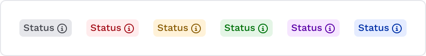
Label and Descriptions
The Label component serves as a succinct marker for categorizing or identifying elements within a user interface. It offers a clear and visually appealing way to highlight attributes, statuses, or pertinent information. Additionally, a Label may incorporate an optional icon, enabling users to access supplementary details or tooltips that elaborate on the associated data, enhancing user understanding and interaction.
General
These are the base variables for all Label types that are mentioned below. Moderate Contrast Labels offer a balanced appearance for most regular usage scenarios. Used on graphs.
Property | Variable name |
|---|---|
| Vertical padding | - -us-label-general- v-padding |
| Horizontal padding | - -us-label-general- h-padding |
| Border radius | - -us-label-general-border-radius |
Neutral Status
Property | Variable name |
|---|---|
| Font color | - -us-label-moderate- contrast-neutral-text-color |
| Background | - -us-label-moderate- contrast-neutral-background-color |
| Border color | - -us-label-moderate- contrast-neutral-border-color |
Primary Status
Property | Variable name |
|---|---|
| Font color | - -us-label-moderate- contrast-primary-text-color |
| Background | - -us-label-moderate- contrast-primary-background-color |
| Border color | - -us-label-moderate- contrast-primary-border-color |
Secondary Status
Property | Variable name |
|---|---|
| Font color | - -us-label-moderate- contrast-secondary-text-color |
| Background | - -us-label-moderate- contrast-secondary-background-color |
| Border color | - -us-label-moderate- contrast-secondary-border-color |
Success Status
Property | Variable name |
|---|---|
| Font color | - -us-label-moderate- contrast-success-text-color |
| Background | - -us-label-moderate- contrast-success-background-color |
| Border color | - -us-label-moderate- contrast-success-border-color |
Warning Status
Property | Variable name |
|---|---|
| Font color | - -us-label-moderate- contrast-warning-text-color |
| Background | - -us-label-moderate- contrast-warning-background-color |
| Border color | - -us-label-moderate- contrast-warning-border-color |
Error Status
Property | Variable name |
|---|---|
| Font color | - -us-label-moderate- contrast-error-text-color |
| Background | - -us-label-moderate- contrast-error-background-color |
| Border color | - -us-label-moderate- contrast-error-border-color |
Loader
The Loader component is a visual indicator used to inform users about the ongoing progress of an action or operation. It provides visual feedback to users, indicating that the system is processing their requests or loading content. There are two types of Loaders:
- Spinner
The Spinner type of Loader displays an animated circular or linear motion that continuously rotates or moves in a loop. It is used when the duration of the process or task is unknown or when the process is too complex to be represented by a progress bar (like loading screens or any other job that requires the user to wait for a response).
- Progress Bar
The Progress Bar type of Loader is a graphical representation of the progress of a process or task. It is used when the duration of the process or task is known, and it is possible to estimate how much time remains until completion.
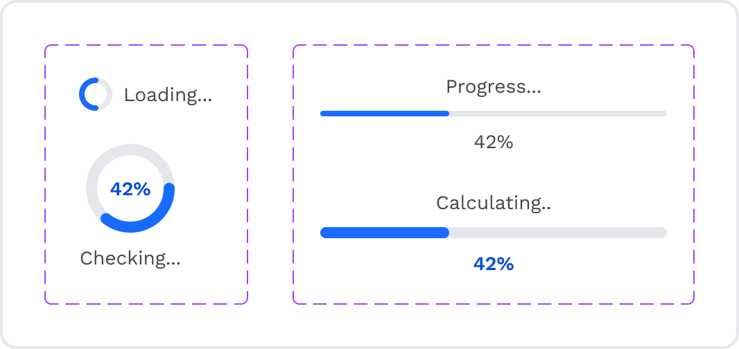
Property | Variable name | Description |
|---|---|---|
| Background | --us-loader-track-color | Track color is the color of the base of the progress bar or spinner (often in shades of gray). |
| Background | --us-loader-progress-color | Progress color is the color that indicates the loading or progress dynamics (often in the primary color). |
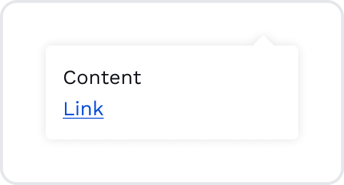
Popup
The Popup component is a versatile user interface element that displays additional information, notifications, or user interactions in an overlay window. It provides focused content without navigating to a new page or disrupting the user's workflow.
Property | Variable name | Description |
|---|---|---|
| Border | --us-popup-border-radius | |
| Shadow | --us-popup-shadow | |
| Status icon | --us-popup-status-icon | This variable is used to display an icon (danger, success, info, or warning) above the popup title. |
Radio button
The Radio button component presents users with a list of mutually exclusive options or choices. It allows users to select a single option from the list, indicating their preference or choice.
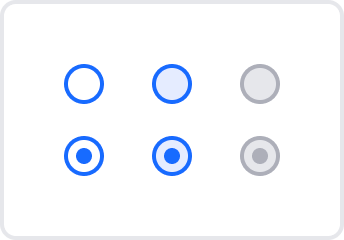
Property | Variable name | Description |
|---|---|---|
| Width | --us-radiobutton-base-width | |
| Height | --us-radiobutton-base-height | |
| Border width | --us-radiobutton-border-width | |
| Border color | --us-radiobutton-border-color | |
| Dot color | --us-radiobutton-dot-color | This variable changes the color of the dot that appears when the Radio button component is in the selected state. |
Hover
Property | Variable name |
|---|---|
| Background | - -us-radiobutton-hover-bg-color |
Disabled
Property | Variable name | Description |
|---|---|---|
| Background | --us-radiobutton-disabled-bg-color | |
| Border color | --us-radiobutton-disabled-border-color | |
| Dot color | --us-radiobutton-disabled-dot-bg-color | This variable changes the dot color that appears when the Radio button component is in the selected but disabled state. |
Scroll and Dots
Dots are used to switch between images or screens (e.g., Intro screens).
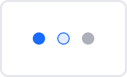
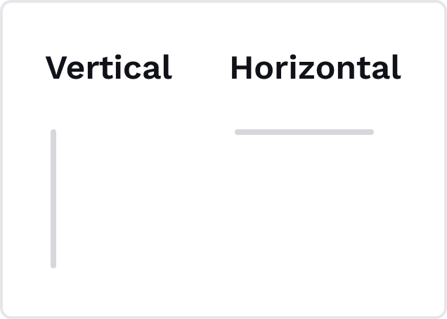
Scroll (horizontal and vertical) has one color that refers --us-scroll-dot-dot-normal-color.
Property | Variable name | Description |
|---|---|---|
| Color | --us-scroll-dot-dot-active-color | This variable changes the Dot component color while it is active. |
| Color | --us-scroll-dot-dot-normal-color | This variable changes the Dot component color while in the default state. |
Hover & Focused
Property | Variable name |
|---|---|
| Background | - -us-scroll-dot-dot-hover-bg-color |
| Border color | - -us-scroll-dot-dot-hover-border-color |
Snackbar
The Snackbar component is a temporary, non-intrusive message or notification at the bottom of the user interface. It provides feedback, alerts, or simple interactions without interrupting the user's current task.
There are four main variants of Snackbars:
- Info Snackbar provides informative messages or general updates to users.
- Success Snackbar displays messages indicating successful actions or operations.
- Warning Snackbar communicates warnings and alerts about potential issues or actions that require attention.
- Error Snackbar informs users about errors or unsuccessful actions that need their attention.
Each Snackbar variant comes in two sizes: large and small.
- Small Snackbar displays a message and related optional actions and can contain a link and button (Undo).
- Large Snackbar includes more content and title. It can be used for more critical actions or information.
Property | Variable name | Description |
|---|---|---|
| Vertical padding | --us-snackbar-base-v-padding | This variable changes the Dot component color while it is active. |
| Horizontal padding | --us-snackbar-base-h-padding | This variable changes the Dot component color while in the default state. |
| Title color | --us-snackbar-info-title-color | |
| --us-snackbar-success-title-color | ||
| --us-snackbar-warning-title-color | ||
| --us-snackbar-error-title-color | ||
| Icon color | --us-snackbar-info-icon-color | |
| --us-snackbar-success-icon-color | ||
| --us-snackbar-warning-icon-color | ||
| --us-snackbar-error-icon-color | ||
| Border | --us-snackbar-info-border-left | This is the border displayed only on the left side of the Snackbar component and corresponds to the icon color of each option. This variable is used to change border style, border color, and border width. This applies to all border-left variables (below). |
| --us-snackbar-success-border-left |
| |
| --us-snackbar-warning-border-left |
| |
| --us-snackbar-error-border-left |
| |
| Border | --us-snackbar-base-close-border-left | This is the border that is displayed only on the left side of the close icon and separates the close icon (the option to dismiss the Snackbar) and the textual content. This variable is used to change border style, border color, and border width. |
| Border radius | --us-snackbar-base-border-radius | |
| Shadow | --us-snackbar-base-shadow |
Tab
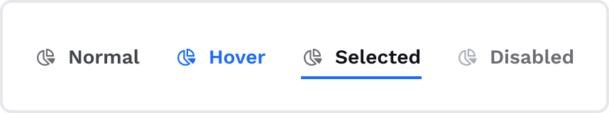
The Tab component is a navigational element commonly used in user interfaces to organize content into multiple sections or categories. It allows users to switch between different tabs to access different sets of information or functionalities.
Line tab
Line tabs feature a simple horizontal line beneath the active tab, providing a clean and minimalist visual indicator of the selected tab. It is a middle-level tab, the most used one. It serves for navigation between groups of related content. The line tab can be used with or without an icon.
Property | Variable name | Description |
|---|---|---|
| Vertical padding | --us-tabs-line-v-padding | |
| Font color | --us-tabs-line-color | |
| Icon color | --us-tabs-line-icon-color | |
| Border | --us-tabs-line-border-bottom | This variable is only used to change the bottom border style, border color, and border width. |
Hover
Property | Variable name | Description |
|---|---|---|
| Font color | --us-tabs-line-hover-color | |
| Icon color | --us-tabs-line-hover-icon-color | |
| Border | --us-tabs-line-hover-border-bottom | This variable is only used to change the bottom border style, border color, and border width. |
Active
Property | Variable name | Description |
|---|---|---|
| Font color | --us-tabs-line-active-color | |
| Icon color | --us-tabs-line-active-icon-color | |
| Border | --us-tabs-line-active-border-bottom | This variable is only used to change the bottom border style, border color, and border width. |
Disabled
Property | Variable name | Description |
|---|---|---|
| Font color | --us-tabs-line-disabled-color | |
| Icon color | --us-tabs-line-disabled-icon-color | |
| Border | --us-tabs-line-disabled-border-bottom | This variable is only used to change the bottom border style, border color, and border width. |
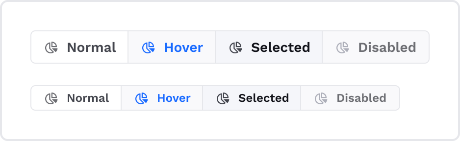
Pill tab
Pill tabs display a more prominent rounded visual indicator. It is a lower-level tab that serves for switching between views. Also, it can be used as a date period selector inside the date picker, with or without an icon. Pill tabs have two sizes - small and large.
Property | Variable name |
|---|---|
| Font color | - -us-tabs-pill-color |
| Icon color | - -us-tabs-pill-icon-color |
| Border color | - -us-tabs-pill-border-color |
| Background | - -us-tabs-pill-background |
| Border radius | - -us-tabs-pill-border-radius |
| Horizontal padding | - -us-tabs-pill-h-padding |
| Vertical padding (Small) | - -us-tabs-pill-s-v-padding |
| Vertical padding (Large) | - -us-tabs-pill-l-v-padding |
Hover
Property | Variable name |
|---|---|
| Font color | - -us-tabs-pill-hover-color |
| Icon color | - -us-tabs-pill-hover-icon-color |
| Border color | - -us-tabs-pill-hover-border-color |
| Background | - -us-tabs-pill-hover-background |
Active
Property | Variable name |
|---|---|
| Font color | - -us-tabs-pill-active-color |
| Icon color | - -us-tabs-pill-active-icon-color |
| Border color | - -us-tabs-pill-active-border-color |
| Background | - -us-tabs-pill-active-background |
Disabled
Property | Variable name |
|---|---|
| Font color | - -us-tabs-pill-disabled-color |
| Icon color | - -us-tabs-pill-disabled-icon-color |
| Border color | - -us-tabs-pill-disabled-border-color |
| Background | - -us-tabs-pill-disabled-background |
Folder tab
Folder tabs resemble the top of a folder, with a folded corner representing the active tab. This unique design can be useful when organizing content in a folder-like structure. It is a higher-level tab and can be used with or without an icon.
Property | Variable name |
|---|---|
| Font color | - -us-tabs-folder-color |
| Icon color | - -us-tabs-folder-icon-color |
| Border color | - -us-tabs-folder-border-color |
| Background | - -us-tabs-folder-background |
| Border radius | - -us-tabs-folder-border-radius |
| Horizontal padding | - -us-tabs-folder-h-padding |
| Vertical padding | - -us-tabs-folder-v-padding |
Hover
Property | Variable name |
|---|---|
| Font color | - -us-tabs-folder-hover-color |
| Icon color | - -us-tabs-folder-hover-icon-color |
| Border color | - -us-tabs-folder-hover-border-color |
| Background | - -us-tabs-folder-hover-background |
Active
Property | Variable name |
|---|---|
| Font color | - -us-tabs-folder-active-color |
| Icon color | - -us-tabs-folder-active-icon-color |
| Border color | - -us-tabs-folder-active-border-color |
| Background | - -us-tabs-folder-active-background |
Disabled
Property | Variable name |
|---|---|
| Font color | - -us-tabs-folder-disabled-color |
| Icon color | - -us-tabs-folder-disabled-icon-color |
| Border color | - -us-tabs-folder-disabled-border-color |
| Background | - -us-tabs-folder-disabled-background |
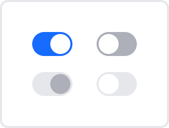
Toggle Switcher
Toggle Switcher is a user interface component that allows users to toggle between two states or options, such as turning a setting on or off, selecting between binary choices, or turning a feature on/off.
Base
Property | Variable name | Description |
|---|---|---|
| Width | --us-switch-base-width | |
| Height | --us-switch-base-height | |
| Border radius | --us-switch-border-radius | |
| Background | --us-switch-bg-color | |
| Width | --us-switch-dot-width | This variable is used to change the width of the toggle dot. |
| Height | --us-switch-dot-heigh | This variable is used to change the height of the toggle dot. |
| Background | --us-switch-dot-bg-color | This variable is used to change the background color of the toggle dot. |
| Border width | --us-switch-dot-border-width | This variable is used to change the border width of the toggle dot. |
Inactive
Property | Variable name |
|---|---|
| Background | - -us-switch-inactive-bg-color |
Active Disabled
Property | Variable name | Description |
|---|---|---|
| Background | --us-switch-active-disabled-bg-color | |
| Background | --us-switch-active-disabled-dot-bg-color | This variable is used to change the background color of the toggle dot in the active disabled state. |
Inactive Disabled
Property | Variable name | Description |
|---|---|---|
| Background | --us-switch-inactive-disabled-bg-color | |
| Background | --us-switch-inactive-disabled-dot-bg-color | This variable is used to change the background color of the toggle dot in the inactive disabled state. |
Tooltip
The Tooltip component is a user interface element that provides additional contextual information or hints when users hover over or interact with a specific UI element. It appears as a small, non-intrusive popup near the target element, helping users better understand its purpose or function. It can contain a link.
Property | Variable name |
|---|---|
| Font color | - -us-tooltip-color |
| Background | - -us-tooltip-background-color |
| Vertical padding | - -us-tooltip-v-padding |
| Horizontal padding | - -us-tooltip-h-padding |
| Border radius | - -us-tooltip-border-radius |
| Shadow | - -us-tooltip-shadow |
Updated 11 months ago