Web Components Integration Guide

How to Integrate Web Components

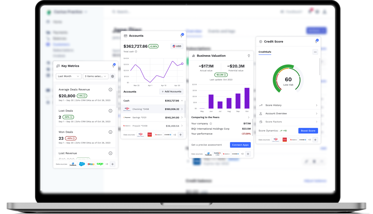
A Web Component, or widget, is an independent functional module with a defined set of unique characteristics and intended functionality. Each Web Component can be easily integrated into a digital environment, such as an online banking app, as a standalone widget, or in combination with other components.

Follow these steps to integrate the upSWOT widget into your environment correctly

Step 1. Add the target Component script to the head of your HTML Document:

<script type="module" src="https://{admin host}/api/v1/cdn/{name}"></script>

Where:

{admin host} – Host name of the Admin Panel.

{name} – Name of the Component.

Available Web Components and their encoded names

WEB COMPONENTCODED NAME
Accountsaccounts
Business Valuationevaluation
Cash Flow Forecastcashflow
Credit Scorecreditscore
Key Metricskpi
Payment Calendarpaymentscalendar
Carbon Footprintcarbonfootprint
Marketingmarketing
eCommerce & Salesecommerce
App Connectorapplicationconnector
Insightsinsights
Credit Score Connectorcreditscoreconnector

Step 2. Insert the selected Component script with the relevant properties into the appropriate part of the page.

<{tag-name}
  class="widget-container"
  api="https://{upSWOT admin host}"
  auth='{"authProps1":"...","authPropsN":"..."}'
></{tag-name}>

Where:
{tag-name} – Name of the Component with the prefix "us".

class – CSS class for the container.

api – Host of the deployed upSWOT web application.

auth – Authorization parameters for Single Sign-on (SSO) authentication. It can be a list of any parameters for cross-server integration to get data on the current client (authentication token, session ID, etc.). For more details, see Web Components SSO Guide.

🚧

Please make sure to use the JSON format for the auth property, as in the example above.

Additional properties may be used to customize the interface and behavior of the Component (see Component Properties).

Available {tag-name} values for each Web Component

WEB COMPONENT{tag-name}
Accountsus-accounts
Business Valuationus-evaluation
Cash Flow Forecastus-cash-flow
Credit Scoreus-credit-score
Key Metricsus-kpi
Payment Calendarus-payment-calendar
Carbon Footprintus-carbon-footprint
Marketingus-marketing
eCommerce & Salesus-ecommerce
App Connectorus-application-connector
Insightsus-insights
Credit Score Connectorus-creditscore-connector

Step 3. Configure widget container size (widget-container class)

.widget-container {
  width: 375px;
  height: 620px;
}

All Web Components are adaptive, adjusting to the styles of the embedded container.

The widget's form factor (horizontal or vertical) is set automatically based on the container's width:

  • Vertical view: width = 375px – 519px
  • Horizontal view: width >= 520px

For any view type, the following container height parameters are the minimum required for the best user experience:

  • Vertical view: 620px
  • Horizontal view: 480px

📘

It is always recommended to set a static height for each widget container.

Step 4 (Optional). Customize the Web Component’s style attributes (eg, fonts, colors, borders, padding, shadows, etc.) by using CSS variables to override the default style. For more details, see Design System Specs.

Below is an example of how to customize sample parameters. Try it to observe how it affects the widget’s interface.

:root {
  --us-font-family: 'Roboto';
  --us-widget-container-radius: 10px;
  --us-widget-container-boxshadow: 0px 4px 9px 0px rgb(0 0 0 / 12%);
}

Cross-Domain Requests

The Web Component allows for cross-domain requests from the provider’s front end to the upSWOT domain if the upSWOT application back end was deployed in a different domain.

To enable cross-domain requests, the provider should supply upSWOT with a list of domains from which the requests will be received.